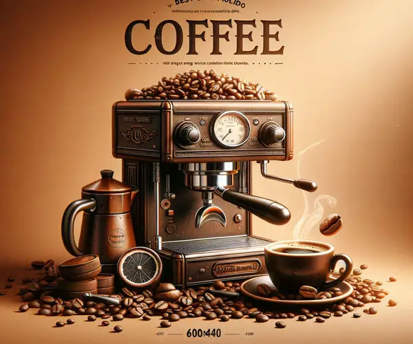
Crafting Your Brand’s First Impression: The Art of Coffee Labels to Print
I remember the first time I truly *noticed* coffee. Not just the aroma wafting from the kitchen, but the whole experience. I was in a small, independent roastery on a trip out West, and there, lined up on the shelves, were bags of beans, each adorned with what felt like a tiny work of art. The colors, the typography, the stories they hinted at – it was a far cry from the plain brown bags I was used to. It sparked a thought: how much of that initial attraction was due to those beautifully designed coffee labels to print?
For any coffee business, from a burgeoning home roaster to a well-established cafe, the packaging is more than just a container; it’s a silent salesperson, a brand ambassador, and often, the very first tangible interaction a customer has with your product. In a market saturated with options, a compelling label can be the deciding factor between a purchase and a pass. This isn’t just about aesthetics; it’s about conveying quality, origin, flavor, and the unique story of your coffee. Let’s dive deep into what makes effective coffee labels to print, and how you can create them to elevate your brand.
Why Your Coffee Labels Matter More Than You Think
Think about your own shopping habits. When you’re faced with two similar products, what draws your eye? Often, it’s the packaging. For coffee, this holds doubly true. The journey from bean to cup is complex and artisanal. Your label is the visual representation of that dedication. It needs to communicate:
- Brand Identity: Who are you? Are you rustic and artisanal, modern and minimalist, or bold and adventurous?
- Product Information: What kind of coffee is it? Where did it come from? What are its tasting notes?
- Quality Assurance: A well-designed label suggests a premium product.
- Shelf Appeal: In a crowded market, your label needs to stand out.
- Legality: Certain information is legally required.
The tactile feel of the label, the quality of the paper, the ink’s vibrancy – these all contribute to the overall perception of your coffee’s value. A flimsy, poorly printed label can inadvertently signal a lower-quality bean, regardless of how exceptional it actually is.
Essential Elements for Your Coffee Labels to Print
Before you even start thinking about design software, it’s crucial to understand the non-negotiable components of a coffee label. These are the foundational pieces that inform your creative choices and ensure you meet both customer expectations and regulatory requirements.
- Brand Name and Logo: This is your identity. It should be prominent, easily recognizable, and consistent with your overall brand.
- Product Name/Blend Name: Is it a single origin? A signature blend? Give it a memorable name.
- Roast Level: Light, Medium, Dark, Espresso Roast? This is critical for consumers choosing their preferred brew.
- Origin/Region: Consumers are increasingly interested in where their coffee comes from. Be specific – e.g., “Ethiopia Yirgacheffe,” “Colombia Huila.”
- Tasting Notes: This is where you can get creative and enticing. Think “notes of dark chocolate, cherry, and almond,” or “floral aromas with a hint of citrus.”
- Net Weight: Typically in ounces and grams.
- Processing Method: Washed, Natural, Honey? This significantly impacts flavor.
- Varietal (Optional but Recommended): For single origins, mentioning the varietal (e.g., Bourbon, Typica, Geisha) adds a layer of detail for enthusiasts.
- Roaster Information: Your company name and location.
- Contact Information/Website: How can customers connect with you or learn more?
- Brewing Recommendations (Optional): Suggestions for how to best enjoy the coffee.
- Certifications (If Applicable): Fair Trade, Organic, Rainforest Alliance, etc.
- Best By Date/Roasted On Date: Essential for freshness. Many consumers prefer “Roasted On” dates.
- Legal Disclaimers: Allergens, if any.
The Design Process: From Concept to Print-Ready Files
Now for the fun part! Transforming those essential elements into a visually appealing and informative label requires a strategic design approach. This is where many businesses grapple with the intricacies of creating effective coffee labels to print.
Step 1: Define Your Brand Aesthetics
Before you sketch a single line, revisit your brand’s core values and target audience. Are you aiming for the artisanal coffee connoisseur who appreciates minimalist design, or the everyday drinker who responds to vibrant, energetic visuals?
- Color Palette: Earthy tones, vibrant pops, or monochrome? Consider the psychological impact of colors.
- Typography: Serif fonts can evoke tradition and sophistication, while sans-serif fonts often feel modern and clean. Ensure readability.
- Imagery/Graphics: Will you use illustrations, photography, abstract patterns, or keep it text-heavy?
- Overall Mood: Cozy, energetic, sophisticated, natural?
Step 2: Sketching and Concept Development
Don’t jump straight into digital. Grab a pen and paper and start sketching. Play with different layouts for your essential information. Consider where your logo will sit, how the tasting notes will be presented, and the hierarchy of information.
Pro Tip: Look at existing coffee labels you admire. What makes them work? What elements do they emphasize? Analyze their layout, color choices, and typography.
Step 3: Digital Design and Software
Once you have a strong concept, it’s time to bring it to life digitally. You have a few options:
- Professional Designer: If your budget allows, hiring a graphic designer specializing in branding or packaging is an excellent investment. They’ll have the expertise to create a professional, print-ready design.
- DIY Design Software:
- Adobe Illustrator/Photoshop: Industry-standard tools offering maximum creative control. They have a learning curve but provide unparalleled results.
- Canva: User-friendly with many templates, it’s a great option for beginners or those on a tighter budget. You can find coffee label templates and customize them extensively.
- Affinity Designer/Photo: Powerful alternatives to Adobe products, often at a one-time purchase price.
When designing, always work in high resolution (at least 300 DPI) and in a CMYK color mode for printing. Prepare your files with bleed (an extra margin that gets trimmed off) to ensure colors go all the way to the edge of your label.
Step 4: Choosing Your Label Material and Finish
The physical properties of your label are as important as the design. This is where the “print” in coffee labels to print becomes critical.
Common Label Materials:
- Matte Paper: Offers a sophisticated, understated look. It’s less prone to glare, making text easy to read.
- Glossy Paper: Makes colors pop and gives a shiny, premium feel. Can be prone to glare.
- Kraft Paper: Evokes a natural, rustic, artisanal feel. Popular for its eco-friendly aesthetic.
- Textured Papers: Linen, eggshell, or other textured stocks can add a tactile dimension to your label.
- Synthetic/Vellum: Durable, water-resistant options, good for humid environments or if the bag might get wet.
Popular Finishes:
- Lamination: A protective coating that adds durability and can give a matte or glossy finish.
- Foil Stamping: Adds metallic accents (gold, silver, copper) for a touch of luxury.
- Embossing/Debossing: Creates raised or indented designs, adding a sophisticated tactile element.
- Spot UV: A clear gloss coating applied to specific areas to create contrast and highlight elements.
Consider how your label will interact with the coffee bag itself. Will it be applied to a valve bag, a gusseted bag, or a stand-up pouch? Ensure your label size and shape are compatible.
Step 5: Finding a Reputable Printer
This is arguably the most crucial step in getting your coffee labels to print successfully. The quality of the printing will directly impact how your brand is perceived.
- Online Print Shops: Companies like Vistaprint, Moo, Sticker Mule, and UPrinting offer a wide range of options for custom labels. They often have online design tools and competitive pricing.
- Local Printers: Sometimes, working with a local commercial printer can offer more personalized service and the ability to see and feel material samples.
- Specialty Label Printers: For unique finishes or high volumes, dedicated label printing companies might be the best choice.
When getting quotes, be prepared to provide:
- Label dimensions and shape
- Material choice
- Quantity needed
- Desired finishes
- Your print-ready artwork (usually in PDF format)
Always ask for a physical proof or a digital soft proof before a full print run to catch any errors.
Common Pitfalls to Avoid When Designing Coffee Labels
Even with the best intentions, it’s easy to stumble. Here are some common mistakes businesses make when preparing their coffee labels to print:
- Overcrowding Information: Trying to fit too much onto a small label leads to clutter and reduced readability. Prioritize what’s most important.
- Poor Typography: Using illegible fonts, too many font styles, or incorrect font sizing. Remember, your tasting notes and origin need to be easily scanned.
- Low-Resolution Images: Using images that look good on screen but become pixelated when printed. Always use high-resolution vector or raster files.
- Incorrect Color Mode: Designing in RGB (for screens) instead of CMYK (for printing) will result in dull, unexpected colors.
- Ignoring Bleed and Trim Marks: Not accounting for bleed can result in white edges where the printer cuts.
- Inconsistent Branding: The label doesn’t align with the brand’s overall visual identity or messaging.
- Forgetting Crucial Information: Missing legally required details or important selling points like roast level or origin.
- Choosing the Wrong Material/Finish: A label that doesn’t hold up to moisture or is hard to read under store lighting is a missed opportunity.
Creative Ideas to Make Your Coffee Labels Stand Out
Beyond the basics, how can you truly make your coffee labels to print sing?
1. Tell a Story
Every coffee bean has a journey. Whether it’s the farmer’s dedication, the unique microclimate of the region, or your roaster’s passion, weave that narrative into your label. This can be done through:
- Illustrations: Depicting the farm, local flora/fauna, or the roasting process.
- Photography: High-quality images of the coffee cherries, the landscape, or the people involved.
- Short Bios: A brief mention of the farmer or co-op.
- Origin-Specific Icons: Small symbols representing the cultural heritage of the region.
2. Emphasize Tasting Notes with Flair
Instead of a dry list, make your tasting notes enticing.
- Descriptive Language: Use evocative words like “velvety,” “bright,” “zesty,” “bold.”
- Visual Cues: Pair tasting notes with small icons or graphics. For “chocolate notes,” a subtle cocoa bean outline; for “citrus,” a tiny lemon wedge.
- “Flavor Wheel” Graphics: Some brands use a visual wheel to highlight primary and secondary flavor notes.
3. Unique Shape and Size
While standard rectangular labels are common, consider a custom die-cut shape that reflects your brand or the coffee itself. A hexagonal label, a shape mimicking a coffee bean, or even a tag-style label can grab attention.
4. Interactive Elements
QR Codes: Link to your website for more information about the coffee’s origin, your roasting process, brewing guides, or even a playlist that pairs well with the coffee. This adds value and encourages deeper engagement.
5. Material and Finish as a Design Element
Don’t just see paper stock and finishes as functional choices. A rugged Kraft label with a simple, black ink design screams artisanal. A metallic foil stamp on a deep, rich background can signify luxury.
6. Minimalist vs. Maximalist
Minimalist: Focus on clean typography, ample white space, and a limited color palette. This often appeals to a sophisticated, design-conscious audience. It can also convey purity and transparency.
Maximalist: Bold colors, intricate patterns, and abundant imagery. This approach can be incredibly impactful, creating a memorable and energetic brand presence. Think vibrant, almost psychedelic patterns or detailed illustrations.
7. Use of Texture
If you’re using a printer that offers tactile finishes like embossing, debossing, or spot UV, use them strategically to highlight your logo, the coffee name, or key descriptive elements. The feel of the label can be as memorable as its look.
Common Related Questions About Coffee Labels to Print
What information is legally required on coffee labels in the US?
The primary regulatory body overseeing food labeling in the US is the Food and Drug Administration (FDA). While there isn’t a single exhaustive list solely for coffee, general food labeling requirements apply. Crucially, your coffee labels to print must include:
- Net Quantity of Contents: This is the weight of the product. It must be declared in both ounces (oz) and grams (g). For example, “Net Wt. 12 oz (340g)”. The declaration must be placed on the principal display panel (usually the front of the package) and must be in both U.S. customary units and metric units.
- Ingredient List (if applicable): For pure coffee (whole bean or ground), there are no added ingredients, so an ingredient list is not required. However, if your coffee is blended with something else (e.g., chocolate, spices, artificial flavors), you MUST list all ingredients in descending order by weight. If you use “artificial flavor” or “natural flavor,” specific rules apply regarding disclosing the source of natural flavors.
- Nutrition Facts Panel (if applicable): For most plain coffee products, a Nutrition Facts panel is *not* required because coffee has negligible amounts of calories, fat, sugar, etc., before any additions by the consumer. However, if you make nutritional claims (e.g., “low calorie,” “fat-free”) or add ingredients that contribute significant nutritional value, you may be required to include a Nutrition Facts panel. The FDA has specific guidelines for when this exemption applies.
- Allergen Declaration: The Food Allergen Labeling and Consumer Protection Act of 2004 (FALCPA) requires the declaration of the eight major food allergens (milk, eggs, fish, crustacean shellfish, tree nuts, peanuts, wheat, and soybeans). If your coffee is processed in a facility that also handles these, or if any of these are used in your product, you must declare them clearly. Often, this is done by stating “Contains [allergen]” or by listing it in the ingredient list.
- Name and Place of Business: You must identify the manufacturer, packer, or distributor of the food by name and address. You can use your business name, or if it’s not your name, you must indicate your relationship to the product (e.g., “Manufactured for [Your Name],” “Distributed by [Your Name]”). A street address, city, state, and ZIP code are generally required, though the street address can be omitted if it is listed in a current city directory.
- Country of Origin: While not always explicitly mandated for coffee itself, if you are importing beans, you may need to adhere to U.S. Customs and Border Protection (CBP) regulations regarding country of origin marking. For domestically roasted coffee, it’s good practice to indicate “Roasted in [Your City, State]” to build consumer trust.
Beyond federal regulations, some states may have additional labeling requirements, though these are less common for basic coffee products. It is always wise to consult with a regulatory expert or legal counsel if you have any doubts, especially if you are making specific claims about your coffee.
How can I make my coffee labels eco-friendly?
Sustainability is a growing concern for consumers, and your coffee labels to print can reflect this commitment. Here’s how:
- Recycled or FSC-Certified Paper: Opt for labels made from post-consumer waste or paper certified by the Forest Stewardship Council (FSC), ensuring it comes from responsibly managed forests.
- Soy-Based or Vegetable-Based Inks: These inks are more environmentally friendly than traditional petroleum-based inks, breaking down more easily and releasing fewer volatile organic compounds (VOCs).
- Water-Based Adhesives: If your labels are self-adhesive, look for manufacturers that use water-based or compostable adhesives.
- Minimalist Design: Reducing the amount of ink coverage can decrease the environmental impact of the printing process. Less ink means less waste.
- Reduced Packaging Size: While your label is part of the packaging, consider the overall coffee bag. Smaller labels or designs that don’t require excessive printing can contribute to a smaller footprint.
- Avoid Lamination/Foil Stamping (if not recyclable): Some finishes, like certain types of lamination or foil, can make labels difficult or impossible to recycle. Research the recyclability of your chosen finishes.
- Work with Eco-Conscious Printers: Many print shops now highlight their sustainability practices. Ask about their energy sources, waste reduction programs, and use of recycled materials.
What’s the difference between a label and a direct print on a coffee bag?
The choice between applying a separate label to a pre-made coffee bag or directly printing the design onto the bag itself has pros and cons:
Labels to Print:
- Pros:
- Flexibility: Easy to change designs, test new marketing messages, or print smaller batches for seasonal offerings.
- Cost-Effectiveness for Small Runs: Printing labels is often cheaper for lower quantities compared to custom bag printing.
- Ease of Application: Can be applied manually or with semi-automatic machines, suitable for home or small-scale operations.
- Variety of Materials: You have a wider selection of papers, finishes, and adhesive types specifically for labels.
- Cons:
- Labor Intensive: Applying labels can be time-consuming, especially for larger volumes.
- Potential for Imperfect Application: Bubbles, wrinkles, or misaligned labels can affect the professional look.
- Durability: Some label adhesives might not hold up as well over time, especially in fluctuating environmental conditions compared to professionally printed bags.
Direct Printing on Coffee Bags:
- Pros:
- Professional Finish: Offers a seamless, integrated look that often appears more premium.
- Durability: The print is part of the bag material, making it highly resistant to wear, moisture, and fading.
- Efficiency for High Volumes: Once set up, the printing process is fast and efficient for large production runs.
- Consistent Quality: Professional printing ensures a uniform and high-quality appearance across all bags.
- Cons:
- High Minimum Order Quantities (MOQs): Direct printing often requires significant upfront investment due to setup costs for plates or machinery.
- Less Flexibility: Changing designs or running small, specialized batches is much more expensive and time-consuming.
- Longer Lead Times: Custom bag printing typically has longer production cycles.
For most emerging coffee businesses or those prioritizing flexibility, starting with high-quality coffee labels to print is a practical and effective approach. As your business grows and order volumes increase, you might then consider the investment in custom-printed bags.
How detailed should my coffee tasting notes be?
The level of detail in your tasting notes is a strategic decision that impacts how you communicate with your customers and positions your brand. It’s about striking a balance between being informative and being accessible.
For a broader, general audience:
Focus on a few primary, easily recognizable flavor profiles. Use relatable terms. Instead of “hints of maillard reaction byproduct with underlying pyrazines,” opt for clear descriptors like:
- Sweetness: Honey, caramel, maple syrup, brown sugar.
- Fruitiness: Berry (strawberry, blueberry), citrus (lemon, orange), stone fruit (peach, apricot).
- Chocolate/Nutty: Dark chocolate, milk chocolate, cocoa, almond, walnut, hazelnut.
- Floral/Herbal: Jasmine, rose, lavender, mint.
- Spice: Cinnamon, clove, nutmeg.
A good range is typically 2-4 prominent notes. For example: “Notes of dark chocolate, ripe cherry, and toasted almond.”
For a more enthusiast or connoisseur audience:
You can get more specific and nuanced. This is where you might use more technical terms or describe subtle undertones:
- Origin-specific descriptors: “Ethiopian berry notes,” “Colombian caramel sweetness.”
- Acidity: “Bright citrus acidity,” “wine-like acidity,” “malic acidity.”
- Body: “Silky smooth body,” “full-bodied and syrupy,” “light and delicate.”
- Finish: “Clean finish,” “lingering sweetness,” “dry cocoa finish.”
- Complex combinations: “A bright acidity that transitions to a lingering milk chocolate and roasted nut finish.”
You might also include a brief description of the overall sensory experience. For instance, “A beautifully balanced cup with a vibrant acidity reminiscent of green apples, evolving into a sweet honeyed body with subtle hints of jasmine on the finish.”
Key considerations:
- Accuracy: Your tasting notes should genuinely reflect the coffee. It’s often best to have multiple people cup (taste) the coffee and compare notes.
- Consistency: If you’re selling a blend regularly, the tasting notes should remain consistent batch to batch, or you should indicate if there are variations.
- Brand Voice: Do your tasting notes fit your brand’s personality? Are they educational, whimsical, or straightforward?
- Space: Remember you’re working with limited label space. Prioritize the most impactful and descriptive notes.
Ultimately, the goal of tasting notes is to educate the consumer, set expectations, and enhance their enjoyment of the coffee. Choose the level of detail that best serves your brand and your target customer.
The world of coffee is rich and diverse, and your packaging should be too. By understanding the core elements of effective design, embracing creative possibilities, and paying close attention to the details of bringing your coffee labels to print, you can ensure your coffee doesn’t just taste great—it looks great and tells a compelling story, too.
