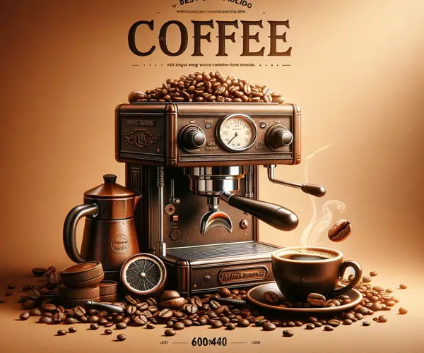
Mastering Coffee Shop Flyer Design: Brewing Up Success with Eye-Catching Promotions
I remember walking into a new coffee shop downtown, the aroma of freshly roasted beans instantly wrapping around me like a warm hug. But what really grabbed my attention wasn’t just the smell; it was a vibrant flyer tacked to the corkboard. It featured a steaming mug of coffee with a perfectly frothed latte art heart, and a catchy tagline about their “Morning Wake-Up Special.” Within minutes, I was ordering that special, completely convinced by the flyer’s charm. This experience cemented for me how crucial effective **coffee shop flyer design** is for drawing in customers and boosting sales. It’s not just about printing pretty pictures; it’s about strategic visual storytelling that resonates with your target audience.
A well-executed flyer can be your silent, yet incredibly persuasive, salesperson. It can announce new menu items, promote seasonal drinks, advertise happy hours, or simply remind folks to swing by for their daily caffeine fix. In today’s visually saturated world, standing out from the clutter requires more than just slapping some text onto a piece of paper. It demands thoughtful consideration of color palettes, typography, imagery, and layout – all working in harmony to create a compelling message.
The Anatomy of an Irresistible Coffee Shop Flyer
So, what makes a coffee shop flyer truly irresistible? It’s a blend of art and science, where creativity meets strategy. Let’s break down the essential components that contribute to a winning design.
1. Understand Your Objective and Audience
Before you even think about colors or fonts, ask yourself: What do you want this flyer to achieve? Are you trying to attract new customers with a grand opening discount? Are you promoting a limited-time seasonal beverage? Or perhaps you’re highlighting your loyalty program? Your objective will dictate the message and the overall tone of your design.
Equally important is knowing *who* you’re trying to reach. Are you aiming for busy commuters needing a quick grab-and-go? Students looking for a study spot with affordable treats? Or a more discerning crowd interested in single-origin pour-overs? Tailoring your design to your specific audience – their aesthetic preferences, their language, their needs – will make your flyer far more effective. For instance, a flyer targeting students might feature a more playful, trendy design with student discounts prominently displayed, while a flyer for a more upscale cafe might lean towards elegant typography and sophisticated imagery.
2. The Power of Visuals: Images That Speak Louder Than Words
When it comes to coffee, people *love* to see it. High-quality, mouth-watering photography is your most potent weapon. Think close-ups of creamy lattes with intricate art, a perfectly brewed espresso with a rich crema, or a freshly baked pastry looking absolutely divine.
* **Authenticity is Key:** Use actual photos of *your* coffee and food. Stock photos can look generic and uninspired.
* **Show, Don’t Just Tell:** Instead of saying “Delicious Coffee,” show a steaming mug that makes people crave it.
* **Focus on the Experience:** Images can evoke feelings. A shot of friends laughing over coffee can convey community and warmth. A close-up of hands holding a warm mug can suggest comfort and relaxation.
* **Consistency with Branding:** Ensure the style of your photography aligns with your cafe’s overall brand aesthetic. Is it rustic and cozy, or modern and minimalist?
3. Typography: More Than Just Pretty Letters
The fonts you choose play a significant role in conveying your brand’s personality and readability. A mismatched or difficult-to-read font can send potential customers running.
* **Hierarchy is Crucial:** Use different font sizes and weights to guide the reader’s eye. The most important information (like a special offer or the cafe’s name) should be the most prominent.
* **Font Pairing:** Stick to two, maybe three, complementary fonts. A common and effective pairing is a bolder, more decorative font for headings and a clean, legible sans-serif or serif font for body text.
* **Readability is Non-Negotiable:** Ensure your text is large enough to read from a reasonable distance. Avoid overly scripty or condensed fonts for important details.
* **Brand Alignment:** A sophisticated serif font might suit a classic cafe, while a modern sans-serif could work better for a contemporary spot.
4. Color Palette: Setting the Mood and Grabbing Attention
Colors evoke emotions and can instantly communicate the vibe of your coffee shop.
* **Warm Tones:** Browns, reds, oranges, and yellows often evoke warmth, comfort, and energy – perfect for coffee.
* **Cool Tones:** Blues and greens can suggest calmness and freshness, useful for iced drinks or a more relaxed atmosphere.
* **Contrast for Readability:** Ensure there’s enough contrast between your text and background colors for easy reading.
* **Brand Consistency:** Use colors that are part of your established brand identity.
* **Limited Palette:** Don’t go overboard with too many colors. A well-chosen palette of 2-3 main colors will create a cohesive look.
5. Essential Information: The What, Where, and When
A beautiful flyer is useless if people don’t know what you’re offering or how to find you.
* **Headline:** Catchy, concise, and benefit-driven. What’s the main draw?
* **Offer Details:** Clearly state the promotion, discount, or new item.
* **Cafe Name and Logo:** Make it instantly recognizable.
* **Address and Location:** Easy to find. Include a small map if space allows or if you’re in a tricky spot.
* **Hours of Operation:** Especially if the flyer is for a specific event or time-sensitive offer.
* **Contact Information:** Phone number, website, social media handles.
* **Call to Action (CTA):** What do you want people to do? “Visit Us Today!” “Show This Flyer for 10% Off!” “Try Our New Pumpkin Spice Latte!”
6. Layout and White Space: Letting Your Design Breathe
A cluttered flyer is overwhelming and difficult to process. White space (or negative space) is your friend!
* **Organize Information Logically:** Guide the reader through the content in a natural flow.
* **Balance Visuals and Text:** Don’t let one element overpower the other.
* **Use Grids:** A subtle grid system can help align elements and create a sense of order.
* **Don’t Be Afraid of Empty Space:** It makes the important elements stand out and improves readability.
Actionable Steps for Designing Your Coffee Shop Flyer
Ready to put these principles into practice? Here’s a step-by-step guide to designing a flyer that gets results.
Step 1: Define Your Goal and Target Audience
* **Write down your primary objective:** What do you want the flyer to achieve? (e.g., increase foot traffic by 15%, sell 50 units of a new pastry).
* **Describe your ideal customer for this promotion:** What are their demographics, interests, and motivations?
Step 2: Brainstorm Your Message and Offer
* **Craft a compelling headline:** Make it attention-grabbing and clearly state the benefit.
* **Determine the core message:** What is the most important thing you want to communicate?
* **Finalize your offer:** Be specific and enticing (e.g., “Buy One, Get One Free on all Lattes,” “20% Off Pastries with any Coffee Purchase”).
Step 3: Gather Your Visual Assets
* **Take high-quality photos:** If you don’t have professional photos, invest in a good photographer or learn to take great shots yourself. Ensure they reflect your brand.
* **Source your logo and branding elements:** Make sure you have high-resolution versions.
Step 4: Sketch Out Your Layout (Even a Simple Doodle Helps!)
* **Plan where each element will go:** Headline at the top? Image central? Contact info at the bottom?
* **Consider the visual flow:** How do you want people to scan the flyer?
Step 5: Choose Your Design Tools
* **Professional Software:** Adobe Photoshop, Illustrator, or InDesign offer the most control.
* **User-Friendly Online Tools:** Canva, Adobe Express (formerly Adobe Spark), and PicMonkey are great for those with less design experience. They offer templates and drag-and-drop functionality.
* **Consider Your Budget and Skill Level:** For a one-off flyer, an online tool might be perfect. For ongoing marketing collateral, investing in professional software or hiring a designer is wise.
Step 6: Select Your Color Palette and Typography
* **Use a color palette generator:** Tools like Adobe Color or Coolors can help you find harmonious color schemes.
* **Choose fonts that align with your brand:** Test them for readability.
Step 7: Design Your Flyer – Iterative Process!
* **Start with a template or a blank canvas.**
* **Add your logo and essential text.**
* **Incorporate your chosen imagery.**
* **Refine the layout, ensuring good balance and white space.**
* **Pay close attention to alignment and spacing.**
* **Ensure your Call to Action is clear and prominent.**
Step 8: Review and Get Feedback
* **Proofread everything meticulously!** Typos and grammatical errors look unprofessional.
* **Ask a friend or colleague to review it.** Do they understand the offer immediately? Is it visually appealing?
* **Check for clarity and impact.** Does it make *you* want to visit the coffee shop?
Step 9: Prepare for Printing or Digital Distribution
* **For Printing:**
* Ensure your file is set to the correct size (e.g., 4×6 inches, 5×7 inches).
* Use a high resolution (300 DPI is standard for print).
* Save your file in a print-ready format (usually PDF).
* Consider the paper type and finish – matte, glossy, cardstock.
* **For Digital Distribution (Social Media, Email):**
* Optimize file size for faster loading.
* Save in appropriate formats (JPEG, PNG).
* Consider different aspect ratios for various platforms.
Common Coffee Shop Flyer Design Mistakes to Avoid
Even with the best intentions, design pitfalls can derail your efforts. Be mindful of these common blunders:
* **Too Much Text:** People are visual creatures. Walls of text are intimidating and rarely get read.
* **Poor Image Quality:** Blurry, pixelated, or poorly lit photos scream “amateur.”
* **Clashing Colors or Too Many Colors:** A chaotic color scheme is jarring and unprofessional.
* **Illegible Fonts:** If people can’t read it, what’s the point?
* **Lack of Clear Call to Action:** Don’t assume people know what to do next.
* **Ignoring Brand Consistency:** A flyer that looks completely different from your cafe’s existing branding can be confusing.
* **Overcrowding:** Cramming too much information or too many design elements into a small space.
* **Forgetting Essential Details:** Leaving out your address or offer specifics.
### Creative Ideas for Coffee Shop Flyer Design
Let’s inject some personality and innovation into your flyers. Beyond the standard “sale” announcement, consider these creative approaches:
1. The “Behind the Beans” Story Flyer
* **Concept:** Highlight the origin of your coffee beans, your roasting process, or the story of a specific blend.
* **Visuals:** Feature photos of coffee farms, roasting machines, or beautifully presented beans.
* **Tone:** Informative, passionate, and appreciative of quality.
* **Example:** “Taste the Terroir: Discover Our Ethiopian Yirgacheffe – Notes of Blueberry and Jasmine.”
2. The Seasonal Sip Showcase
* **Concept:** Announce and visually entice customers with your limited-time seasonal offerings.
* **Visuals:** Use rich, evocative imagery that matches the season (e.g., warm autumn colors for pumpkin spice, icy blues for summer refreshers).
* **Tone:** Festive, exciting, and inviting.
* **Example:** “Fall into Flavor: Introducing Our Maple Pecan Latte – A Cozy Hug in a Mug!”
3. The Loyalty Program Power-Up
* **Concept:** Clearly explain the benefits of your loyalty program and encourage sign-ups.
* **Visuals:** Use icons to represent rewards (e.g., a free coffee cup, a star).
* **Tone:** Rewarding, appreciative, and straightforward.
* **Example:** “Your Coffee Habit, Rewarded! Earn Points with Every Sip. Sign Up Today!”
4. The Event Announcement Extravaganza
* **Concept:** Promote live music nights, open mic sessions, poetry readings, or workshops held at your cafe.
* **Visuals:** Feature images that capture the event’s vibe (e.g., a microphone, musical notes, an open book).
* **Tone:** Lively, engaging, and community-focused.
* **Example:** “Unwind with Us: Live Acoustic Music Every Friday Night!”
5. The “Meet Your Barista” Feature
* **Concept:** Introduce your skilled baristas, fostering a personal connection with your customers.
* **Visuals:** A friendly, professional headshot of the barista alongside a close-up of a beautifully crafted drink.
* **Tone:** Personal, friendly, and expert.
* **Example:** “Meet Sarah! Her Signature Latte Art is Almost as Amazing as Her Personality. Come Say Hi!”
#### 6. The “Coffee Pairings” Guide
* **Concept:** Suggest ideal food pairings for specific coffee drinks or beans.
* **Visuals:** Images of coffee alongside complementary pastries, sandwiches, or desserts.
* **Tone:** Culinary, sophisticated, and enticing.
* **Example:** “The Perfect Match: Our Bold Dark Roast – Expertly Paired with Our Rich Chocolate Croissant.”
7. The Community Spotlight
* **Concept:** If you source ingredients locally or partner with local businesses, highlight these relationships.
* **Visuals:** Photos of local producers, farmers, or partner businesses.
* **Tone:** Supportive, community-oriented, and ethical.
* **Example:** “Sourced Locally, Brewed with Love: Proudly Featuring [Local Bakery Name] Pastries.”
Quick Answer to “What Makes a Good Coffee Shop Flyer Design?”
A good coffee shop flyer design is clear, visually appealing, and persuasive. It effectively communicates a compelling offer or message through high-quality imagery, readable typography, and a well-organized layout. It must also accurately reflect the coffee shop’s brand identity and provide all essential information, including the offer, location, and contact details, all while prompting a desired action from the reader.
Common Related Questions About Coffee Shop Flyer Design
**Q1: How do I choose the right size for my coffee shop flyer?**
The ideal size for your coffee shop flyer depends on where and how you plan to distribute it. For a general all-purpose flyer, common sizes like 4×6 inches or 5×7 inches are popular. They are large enough to contain essential information and visuals without being unwieldy. If you plan to hand them out as takeaways or place them on counter stands, these sizes work well.
If you’re targeting specific display areas, like community bulletin boards or shop windows, you might consider larger formats such as 8.5×11 inches (standard letter size) to ensure visibility from a distance. For a more elegant, postcard-style handout, a smaller 3.5×5 inch option could be effective.
When designing, always consider the bleed area – an extra margin around the edge that gets trimmed off. This ensures that no important content is cut when the flyer is printed. For digital distribution, such as social media posts or email newsletters, you’ll need to design for specific aspect ratios that work best on those platforms, often creating variations of your flyer for different uses.
**Q2: What are the most important pieces of information to include on a coffee shop flyer?**
The most critical information ensures potential customers can understand your offer and act on it. This typically includes:
* **Your Coffee Shop’s Name and Logo:** For immediate brand recognition.
* **A Clear and Compelling Headline:** This should grab attention and highlight the main benefit or offer.
* **Details of the Offer/Promotion:** What exactly are you promoting? (e.g., “10% off all lattes,” “Buy one pastry, get one free,” “New Seasonal Drink Launch”). Be specific and enticing.
* **Your Cafe’s Address:** Essential for people to find you.
* **Hours of Operation:** Especially relevant if the promotion is time-sensitive or if you want to attract customers during specific periods.
* **Contact Information:** A website, social media handle (like Instagram or Facebook), or a phone number can provide further engagement or information.
* **A Strong Call to Action (CTA):** Tell people exactly what you want them to do (e.g., “Visit Us Today!”, “Show This Flyer for Your Discount!”, “Download Our App for Rewards”).
Beyond these essentials, consider adding a brief, enticing description of the product or service if space allows, or a small map if your location is difficult to find.
**Q3: Should I hire a professional designer or design my coffee shop flyer myself?**
The decision to hire a professional designer versus doing it yourself depends largely on your budget, your design skills, and the importance of the flyer to your marketing strategy.
**Hiring a Professional Designer:**
* **Pros:** Professionals bring expertise in visual communication, branding, and marketing. They can create a polished, impactful design that aligns perfectly with your brand and objectives, saving you time and frustration. They also understand print requirements and can ensure your flyer looks great on paper.
* **Cons:** This is generally more expensive than DIY.
**Designing Yourself:**
* **Pros:** It’s cost-effective and gives you complete creative control. Modern design tools like Canva or Adobe Express offer user-friendly interfaces and templates that can help beginners create decent-looking flyers.
* **Cons:** You might lack the technical skills or aesthetic eye to create a truly standout design. You could also spend a significant amount of time learning the software and iterating on designs. There’s a risk of making common design mistakes that can detract from your message.
**Consider this:** If your flyer is for a major event, a grand opening, or a critical promotional campaign where first impressions are paramount, investing in a professional designer is often worthwhile. For smaller, internal promotions or if you have a strong design sense and are working with a tight budget, DIY can be a viable option. Many coffee shop owners find a balance by using online tools for simpler projects and hiring designers for more significant campaigns.
**Q4: How important are colors in coffee shop flyer design?**
Colors are incredibly important in coffee shop flyer design as they play a significant role in evoking emotions, conveying brand personality, and attracting attention. The right color choices can make your flyer memorable and appealing, while the wrong ones can make it look unprofessional or uninviting.
* **Evoking Emotion and Atmosphere:**
* **Warm Colors (Browns, Reds, Oranges, Yellows):** These are commonly associated with coffee, warmth, comfort, energy, and coziness. They can make a customer feel welcomed and craving a hot beverage.
* **Earthy Tones:** Deep browns and beiges can suggest natural, artisanal qualities and high-quality beans.
* **Bold Accents:** Bright colors like reds or yellows can be used sparingly to draw attention to key elements like offers or calls to action.
* **Cool Colors (Blues, Greens):** Can evoke freshness, calmness, and are often suitable for iced drinks or a more modern, clean aesthetic.
* **Brand Consistency:** Your flyer’s color palette should align with your coffee shop’s overall branding. If your cafe uses a specific set of colors in its logo, interior design, and website, using those same colors on your flyer reinforces your brand identity and builds recognition.
* **Readability and Contrast:** Beyond aesthetics, colors are crucial for readability. There needs to be sufficient contrast between text and background colors. For example, dark text on a light background is generally easiest to read. Poor contrast can make your flyer difficult to scan and deter potential customers.
* **Target Audience Appeal:** Different demographics may respond to different color schemes. Understanding your target audience can inform your color choices.
In essence, colors are not just decorative; they are a powerful communication tool. A thoughtfully chosen color palette can significantly enhance the effectiveness of your coffee shop flyer design.
**Q5: How can I make my coffee shop flyer stand out from others?**
In a crowded market, making your coffee shop flyer truly stand out requires a combination of creativity, strategic design, and a unique selling proposition. Here are some ways to achieve this:
* **High-Quality, Appetizing Imagery:** Invest in professional, mouth-watering photography of your actual products. Images of perfectly crafted lattes, delicious pastries, or steaming coffee that look irresistible will immediately capture attention more than generic stock photos.
* **Unique Design Elements:** Consider using a slightly unconventional shape, a distinctive texture, or an interesting die-cut. While standard sizes are practical, a uniquely shaped flyer can be memorable.
* **Clever Headline and Copywriting:** A witty, intriguing, or benefit-driven headline can pique curiosity. Focus on what makes your coffee shop special – is it the fastest service, the most unique brewing methods, the coziest atmosphere, or ethically sourced beans? Highlight that.
* **Consistent Branding with a Twist:** While consistency is key, inject personality. If your brand is generally minimalist, a pop of vibrant color for a specific promotion can be effective. Or, if your brand is playful, lean into fun illustrations or quirky typography.
* **Focus on a Specific Value Proposition:** Instead of just promoting “coffee,” focus on a unique aspect. “Our single-origin beans are roasted in-house daily for peak freshness” is more compelling than a generic coffee advertisement.
* **Interactive Elements (Where Applicable):** For flyers distributed digitally, consider incorporating QR codes that link to your menu, online ordering, or a special discount code. For print, even a “tear-off coupon” section can add an interactive element.
* **Unusual Distribution Methods:** While placing flyers on bulletin boards is common, consider distributing them at local events, partnering with complementary businesses for cross-promotion, or even leaving them in strategic, high-traffic areas relevant to your target audience.
* **Emphasize the “Why”:** People connect with stories. If there’s a story behind your beans, your barista, or your cafe’s mission, weave it into your flyer, even if it’s just a short tagline.
By combining these elements, you can create a coffee shop flyer design that not only gets noticed but also effectively communicates your brand’s value and entices customers to visit.
